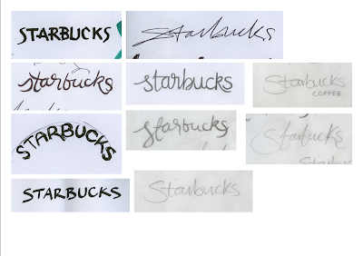
To start my practical investigation into the relevance of hand lettering within logo design, I made note of several well known brands that have values that consider and incorporate elements of human interaction or that use or sell natural and organic products. Some main companies that drew my attention were services or products that involve the wellbeing of the customer and relate to their personal and individual needs as a selling point of the business. I began with a large variety of brands, including TED, American Airlines, XL Recordings, Lush, Island Records, eBay, and many more.
As time went on it became obvious which brands portrayed similar values and which worked well using hand rendered type or lettering. Those that didn't became harder to create a suitable, unique logotype, and this proved that some corporate branding is appropriate for certain businesses. For the initial stage of experimentation I used a variety of materials to draw with, including pencil, fine liner, paint, and markers of various nib width and weight.
After this initial investigation, I chose not to carry certain brands forward to explore more as I found it difficult to represent them using a hand rendered style, and found other logos more appropriate in this medium. These include the likes of BBC, Bodycare, The Body Shop, American Apparel and Costa. This has backed up the fact that hand lettering doesn't work for everything nowadays as cleaner, more uniform type communicates more suitably in some instances.
I drew all my initial workings together and categorised the most successful initial drawings into each brand to compare which ones worked well and distinguish those that didn't. At this stage I asked for feedback from both designers and non-designers to get mixed opinions of which suited their idea of each brand and which were most aesthetically pleasing.


No comments:
Post a Comment