Monday 21 October 2013

OUGD403 (Brief 4) - Message Delivery: Research

For this brief we have to choose an article from a newspaper on Tuesday 22nd October (tomorrow) and create a body of visual research around one story.  To do this I intend to read a variety of articles on the same story from different newspapers, considering the tone of voice of each article.

In groups we have researched different types of newspapers and what the connotations are:


We looked at broadsheets, tabloids and regional newspapers, compared with news shown on TV.  We were able to come up with a lot more TV programmes that show news than actual newspapers.

My chosen article

The article I found most interesting in my copy of Tuesday's Daily Express was "The Roma couple accused of abducting 'blonde angel'", however I have also chosen another article to look into because I didn't want to pick a story that was too sinister or upsetting.

"New nuclear plant will double electricity cost"


This is an issue that will affect us as adults over the next 30-40 years and I think it's an interesting issue related to the Government's choices.


Daily Mail

http://www.dailymail.co.uk/money/news/article-2467475/Power-plant-deal-leaves-UK-handing-90bn-France.html

http://www.dailymail.co.uk/news/article-2471071/Nuclear-plant-NOT-cut-bills-admits-Ed-Davey.html

http://www.dailymail.co.uk/money/bills/article-2470224/Hinkley-point-What-means--grandchildrens--energy-bills.html

The Guardian

http://www.theguardian.com/environment/2013/oct/21/uk-nuclear-power-plant-contract-deal-no-deal

http://www.theguardian.com/environment/2013/oct/20/nuclear-power-station-hinkley-edf

http://www.theguardian.com/environment/2013/oct/21/britain-nuclear-power-station-hinkley-edf

The Sun

http://www.thesun.co.uk/sol/homepage/news/politics/5215774/New-UK-nuclear-power-plant-gets-the-green-light.html


Each of these headings give different impressions of the story by using different tones.  The Daily Mail poses a question that makes the reader consider whether the new nuclear power station is a good idea or if there is no real benefit for us.  It also states "what the nuclear power deal means for you" - making it personal and the reader will want a straight forward answer of the benefits and flaws it will bring.

The Guardian represents the story as a positive thing, using the Prime Minister's name to show authority and professionalism in the program and uses a subheading to give the reader a bit more information on what the story entails using dates/facts.

The Sun does the complete opposite by suggesting the nuclear power plant is a "fallout", playing on the word nuclear.  "Taxpayers hit for billions as nuke plant costs triple" - uses exaggerations and shortened sentences to get a biased point across.


Monday 28th October - Interim Critique

In our crit today we spoke about our research in front of about 12 other people in our groups.  I gained a lot from listening to what other people had researched, including facts and figures and the tone of the article from different newspapers.

For my chosen story I spoke about the different angles from the range of newspapers, ranging from a red top tabloid to a sophisticated broadsheet.  As I didn't really know what to focus my further research on I found the feedback from the crit very helpful.

The article I chose interests me because of the views on recycling and saving the planet - what are the alternatives of building a new nuclear power plant?  From researching the Chernobyl incident it has led me to be concerned about possible consequences this power station could bring to the UK.  In America, there is a much larger range of space for a possible disaster to not harm as many people as in the UK - if anything were to go wrong we would be at a huge risk.

The fact that building a nuclear power plant has become the only option we have left to take, it leads me to question how much do we actually consume? And how much do we waste?  When many UK residents have no conscience about waste and consuming it means we now have no other option than to use nuclear power in the future.  Do people know this? 

The crit gave me further ideas to research into people's opinions on the plant, so I plan to do either surveys or a questionnaire to discover whether people want the plant to be built or not - or if they even care.  The latter is a scary thought as it would confirm that not many people are using resources effectively which is what led our country to be in this situation in the first place.  

What do we actually need? Compare this with what we think we need, or want.  How much power/electricity do we use compared to what we need?  This leads back to recycling and how alternative methods of power source (such as wind turbines) alongside extreme energy saving across the UK could have prevented this situation from occurring if it was addressed several years ago.  

Suggestions were also made to research into No Impact Man, a film released in 2009 which documents a man and his family during their year-long experiment to have zero impact on the environment.  This will be an interesting thing to look in to as it shows someone going to the extreme to help the planet.  


__________________________________


I have thought of 4 questions to ask residents in the UK from the age range of 18-21 (including students) to get further information on how people use energy and electricity at the moment and what they think of the new power plant:

- What is your opinion on the new nuclear power plant?
- Do you leave lights on when you're not in the room?
- How often do you use central heating?
- Do you recycle?

After sending the questions out on Facebook, I got 13 responses:


Responses to opinions on the nuclear power plant included both positive and negative views, as well as 4 people not knowing what the nuclear power plant was - one person clearly not having a clue by responding that they didn't have one themselves.

All but one person seemed to know the negative effects of leaving lights on as they mentioned they sometimes do but try not to to save on bills, or similar reasons.  Only one person replied they do with no reason for why they do, or if they try not to.  This is a positive outcome seeing as 12 out of 13 people realise that they should turn the lights off, even if they don't always.

I got mixed results for use of central heating, a few people mentioned that they use it more often than necessary which suggests they are aware of energy saving, whereas others stated that they use central heating all the time.  4 people said they don't use heating that often, and others said they only use it when they need to, for example in the morning and night in the winter months.

8 out of 13 people said they definitely recycle, 2 said their families recycle at home but they don't, 1 person said they do when possible but still not a great deal, and 2 people said they don't.  

The tone of responses from participants can suggest things in itself.  While one person replied with 'never' recycling, another said 'no I don't, sorry'.  The latter suggests that they know they should recycle as it is environmentally friendly, however the first seems to either not know, or not care.


I gave the same questionnaire out to people age 21+, including homeowners, to see if the responses I got were any different.


The general feedback I got was that a lot more people over the age of 21 knew what the power plant was (a lot of participants were older than 30).  This made me think that my posters need to be targeted at a younger age group to raise awareness.  There were still some people who left lights on although most agreed that they try and remember to turn them off when leaving a room.  Lights were mainly left on in communal rooms where a lot of time was spent rather than in bathrooms/kitchens.


I watched a documentary to research further into my chosen topic which showed the journey of a man and his family throughout a whole year trying to create no impact on the environment.  It documented their lifestyle choices and changes they had to make to reduce their carbon footprint, including not using public transport - only walking or cycling everywhere using self-powered transportation methods, walking up flights of stairs instead of using lifts, and even turning off electricity at a later stage in the experiment.

I found it really interesting to see the extreme levels an eco-friendly family could stretch to and how far was too far - for example the family stopped using disposable nappies and toilet roll.


OUGD403 (Brief 3) - Alphabet Soup: Typeface

Our next brief is to design a typeface which represents the personality of our partner. To do this we asked each other questions to find out a bit more about them...


When are you happiest? when everything is clean OR eating biscuits with a cup of tea
What is your greatest fear? dropping other half of a biscuit in cup of tea
Where is your favourite place in the world? bed
What is your earliest memory? trying beer and hating it
What is your most embarrassing moment? being dumped in front of friends
What makes you unhappy? cats - apart from his grandma's
What is your dream job? graphic designer: branding
Who would play you in the film of your life? The rock - dwayne johnson
What is your favourite smell? puppies
What is your favourite word? urban
What would be your fancy dress costume of choice? predator with 'crazy lazers and all that'
What is your guiltiest pleasure? feeding tortoise and good pens
How do you relax? play music really loud until things shake
If you could edit your past, what would you change? take out being lazy at school


Some answers Elliott gave me included his favourite word being 'urban' and that he's happiest when everything is cleaned. His favourite way to relax is to play music really loud - "to the point where things shake". 


I also asked some separate questions including his favourite colour, number, letter, font, and shape.  From all of his answers I came up with several words relating to his personality: tough, sturdy, structure, straight, bold, soft, tidy, clean, neat, calm, lazy, fun, organised.

Quite a few of these are contradicting words such as 'tough' and 'soft'.


________________________________


After sketching out a few ideas for letterforms from the words I have associated with Elliott, I looked at the fonts in the Adobe font file and these were the ones that stood out to me most as being similar to my impression of Elliott's personality. 


I have asked Elliott which of these fonts is his favourite, answering with 'Antique Olive Bold'.  He dislikes 'Helvetica Rounded' compared with the original Helvetica which to me is quite contrasting to the information I have found out about him already.  

From now on I am going to go with straight edged sans-serif fonts to add to the his interests in structure and the word 'urban' which in my eyes I link together as cities and buildings.  I have decided to scrap the idea of relating my typeface to his handwriting as it doesn't seem to reflect his interests or personality as much as I thought it would.


Tuesday 22nd

After trying to decide on my starting point typeface I began to think whether I had enough information about Elliott's life and personality to choose a suitable font.

Although Elliott said he liked the font Antique Olive I'm not sure whether this is the direction I want to go in when portraying his personality.  

I need to talk to Elliott again to find out some further information about my partner.


I found this page in 'Thinking with Type' which shows examples from students of Maryland Institute College of Art.  I like the block, grid style shape of the letters including the gaps in the top typeface - although it breaks up the letterforms they still stand looking strong and bold.  I also like the bottom typeface as it seems compressed/shortened which could be something to consider for my typeface as Elliott's personality and interests seem to reflect boldness, but his handwriting is quite the opposite, looking shortened and compressed.

I also came across this font on www.dafont.com which I think is a good starting point to manipulate and create my own typeface for Elliott:


I like this font because it's neat and organised (as is Elliott) and I like that all the lines are either vertical or horizontal.  It also seems to have a large x-height which coincides with Elliott's handwriting where his ascenders and descenders are quite short.  Also note that there is no terminal on the 'q' as there is in a lot of typefaces.


Friday 25th

As most of my designs so far have been related to straight, sturdy, structures that are neat/tidy and bold I began to refer to buildings as Elliott loves Grand Designs and sans serif, clean, bold typefaces which in my opinion could represent modern structures such as buildings.

"Ha well I really love old buildings and also buildings that use modern style! But also most grand design buildings are amazing most recent one was one in Yorkshire which was a old cinema house" - Elliott


I have taken some photos of buildings around Leeds that follow the grid-like structure of digital typefaces using only straight edges.

The only exception is the church which has some diagonal structure lines creating several different angles such as the acute angle of the spire.


I followed up on Elliott's interest in Grand Designs and looked at their most recent renovation on a 1920s cinema house.


http://www.dailymail.co.uk/news/article-2402218/Grand-Designs-South-Yorkshire-1920s-cinema-transformed-family-home.html


I have decided not to create an uppercase typeface for this font because Elliott's handwriting is quite petit and timid-looking, and although uppercase would look good I am sticking with lowercase to match a part of his personality (which comes across in his handwriting).  I have decided not to use the font with gaps between letters as in 'squared display' because the gaps don't represent a strong structure.  I want to stick with a digitised looking font to reinforce sturdiness and boldness.  To do this I want to take one of my designed typefaces and make the stroke width thicker to increase boldness.


Friday 1st November - Final Critique

This crit consisted of about 30 students presenting their work for 2 minutes in front of the rest of us.  I thought this was a good way to showcase what we had done and get constructive feedback on our final typeface. 

Wednesday 16 October 2013

OUGD401 - Semiotics Part 1


Semiotics are a scientific way of analysing meaning.  British culture has given things certain meanings, for example colours may represent something different in Britain than they do in other countries.  In different cultures signs have different meanings as well.  The way we dress or wear our hair connotes a certain personality or class, e.g. wearing a suit is a code for smart - it doesn't mean suits are smart in other cultures however.

Visual clichés are everywhere, from typography created to connote a certain era or country (e.g. bamboo style for Hawaii) to cartoon characters representing stereotypes, such as PC Plod from the cartoon Noddy.  This can be related to different representations across different TV programmes of the same character.  The policeman in The Simpsons is incompetent and conventional, playing on the stereotype of lazy policemen who eat donuts all the time and don't solve the issues they are employed to do so. This is a stark contrast from PC Plod who is represented as a caring, all round nice policeman that solves everyone's problems in ToyTown.  Both of these are very different to the real policeman in everyday life, shown in the media as faceless authority.

Meanings of signs and symbols can shift, coming from the audience not the objects.  The ideological meaning can become clear by connoting cultural artefacts.

Monday 14 October 2013

OUGD403 (Brief 2) - Alphabet Soup: Illustrator

Thursday 17th

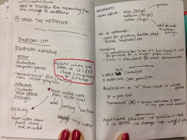
We were taught a few basics to using Adobe Illustrator with James in the Mac Suite today.  One of the main tools he talked us through was the pen tool, a vital piece for graphic designers.  Having never used Illustrator before I found the workshop helpful as an introduction.

We were given short tasks to repeat patterns that had been made digitally, which included both straight lines and curves, in different orders:


Using the pen tool we made both straight lines and curves. 


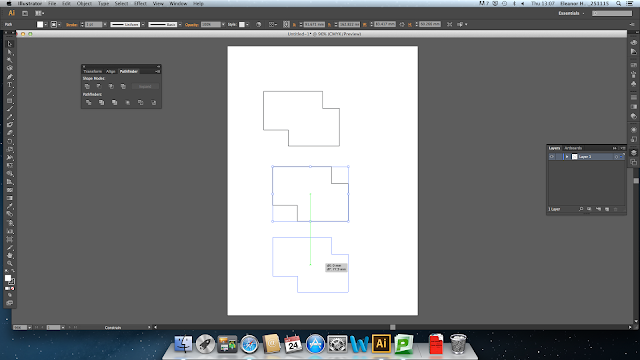
We then went on to learn about shapes and how to merge two shapes together.  You can do this by using the pathfinder tool (box to the left of white page):


Select both rectangles using arrow tool and click 'Unite' button in the pathfinder box (first button):


Result = the inside lines of the shape are removed to create a new shape:


We also learnt how to copy a shape.  Using the alt key and dragging the shape it copies it, so you can copy objects exactly in a simple and efficient manner:


Another tool we learnt how to use was changing the stroke weight of shapes and lines.  Here it shows you can change from 0.25pt to 100pt (or larger if necessary).
Here shape is shown at 10pt.
And here at 40pt.
Underneath the stroke weight tools you can tick the 'dashed line' box.  This makes the outline of any shape or line dashed (as shown below).
1pt dashed line shape.


Vector images are different to picture based images because they readjust when scale up or down so that they maintain a high quality.  They are used primarily for illustrations and computer games.  Renaissance (a French animation film) uses vector graphics as well for the ease of editing and high quality result. 


Thursday 24th

Today we carried on from last week by learning how to edit and reform marks using the pen tool.


Here I was able to change parts of this line editing the loops and curves. This would be helpful when making mistakes or changing a design slightly.

I also learnt how to change a line from filled in to just an outline, by selecting View - Outline.


I then experimented with both elements - using an outline and changing the design slightly by adding anchor points to extend the path of my line.


Using the eraser tool I was able to remove parts of the blue box I had created to show the image underneath.


Learning how to align shapes


Another key learning point for Illustrator is how to transform and move objects in a quick yet precise way.  James showed us how to multiply, align, move, and transform shapes in the fastest possible way which will help us to save time when designing.

I created five random shapes using the rectangle tool and selected them all by dragging over them whilst the arrow tool was selected:


I then used the above 'align/transform' box (with align selected) to move these objects into a certain place.  Here I vertically aligned them so the top of every shape was aligned:


I also tried this out by aligning them to the left using a different icon under the 'align' section: 


Some other keyboard shortcuts I have learnt include the rotate tool - an easy way to achieve similar shapes or rotated objects (e.g. letterforms); using 'alt' to quickly copy/paste an object; the paintbrush tool; the correcting pencil tool, and more.


Rotating and multiplying objects

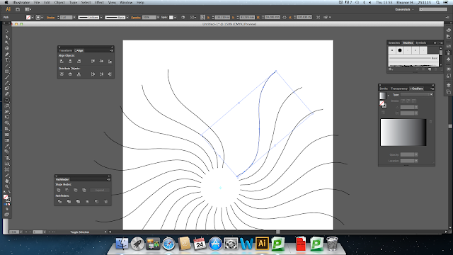
Using the pencil tool I drew a slightly curved line as an example to practice with.  I then clicked on the rotate tool, then selected a space just below the bottom of my curve as my axis.  To make the white circle in the middle smaller I would need to select a space much nearer to the end of my curved line.


By pressing 'Cmd+d' I was able to create as many replicas of my curved line as I wanted - all automatically set to a few degrees apart, creating a circular rotated design.

I then tested this out again using the pen tool to create a jagged line:


I had to group the 3 separate lines together by selecting 'Object - Group' so that I could copy the shape as a whole rather than one line at a time.
Again, I used the rotate tool, then selected a space nearby as my axis, then Cmd+d to create more and more of the same shape - eventually creating a circular shape.


As I went on, the shape became more dense.  This can be done with any object - even text: 


I can use this knowledge when creating designs in the future.


Adding Text

There are two ways to create text in Illustrator.

1. Click and drag (while 'T' text tool is selected)
This creates a text box, size of your choice, which fills up when you keep on typing and can be stretched after being created to whatever size, while the text size stays the same.  When there is too much text in a box, the output goes red (a small box at the bottom right corner of the text box).  

2. Click and type (while 'T' text tool is selected)
When you have clicked once using the text tool, there is unlimited amount of space to fill when typing.  When selecting the text to edit or move, adjusting the box size means adjusting the text size as well.  To keep the font in the correct proportions the shift key needs to be held down.


When using the first method to create text, when text overflows that box you can create a new text box and link them so that whatever type is overflowing in the first box it automatically goes into the second, linked box.  This is ideal for newspaper or leaflet design which is something I am really interested in.

This can be done by double clicking the output box, and this automatically links the two together.


Red box indicating that the content has overflowed the box.

Second box is created next to/below first box and excess text is automatically in that box.


Drag the second box to wherever and blue line shows link between the two text boxes:


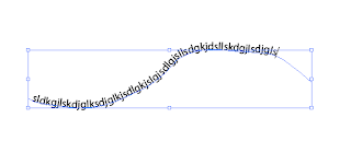
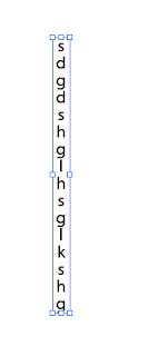
Other type tools include the vertical type tool and type on a path tool:


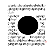
We also learnt how to text wrap.  As an example I did this circle shape in the middle of a block of text:


Object - Text wrap - Make


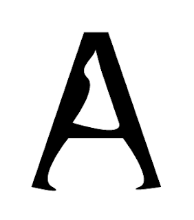
One of the final things we learnt was how to distort and edit existing letterforms.  As an example I tried this out with the letter 'A'.


I began by typing my desired letter and pressing Cmd+Shift+O to create extra points across the shape (shown as blue squares on the outline).  This helps to distort the shape however I like.


I could use the normal pen tool (as I have here) to create block shapes/distortions to the letterform.  However this gives me less control so a better tool to use would be the Convert Anchor Point Tool which lets me choose any point on the outline of the letterform to move around and change as freely as I would like.