As a group we looked at this years college prospectus, designed this year by external designers. We all agreed there were several bad designs included in the book, a few I will explain in more detail...

The foiled text doesn't look that bad with the sophisticated old style serif typeface, however the serifs one the 'A' are slanted - not sure if this is intentional or not.
I also dislike the vertical lines from 'Leeds College of Art' up to 'Prospectus' and down to '2013/14' - there is no need or purpose for them and I think the design would look cleaner and more professional without them.
The background image shows a nice set of student's work in black and white, however the double transparency of this photo and the geometric shapes makes the front cover (the page everyone sees that should make people want to pick up/read it) quite dull and bland.
Although there is use of colour, I'm not sure they compliment each other or draw the audience in at all.

'Leeds College of Art' works well against the dark colours of the image behind, however against a lighter background not so much and the word 'art' seems to be covered behind the large, irregular geometric shape. It could have worked better if the text was shadowed and on top of the shape.
I think the irregularity of the shape hasn't been thought about much - especially on the top right hand corner of the pale green shape where there isn't a point, but a very short edge which looks out of place. A way to fix this could be to make that edge longer, by cutting further into the shape at the same angle.
The black and blue stripes in the bottom left hand corner seem out of place and don't relate to anything else on the page. Perhaps the rest of the image behind would have looked better in that space to balance out the colours and design.


Another thing I dislike about the layout of this prospectus is the colour choices and design of the background colour and geometric shapes.
(Left) The designers have chosen to put a white box on top of/next to a creme border - two colours that shouldn't be used next to each other. Especially when the creme is such a pale, barely noticeable shade. The white makes the creme border look off-white and dirty - a deeper or more vibrant colour would have been better (if using a background colour at all).
(Right) This page shows another of the many geometric shapes throughout the book, pink fading out against pale creme, against white. On top of this, the designers have placed a photo covering two of these background shapes, which I feel makes the page look cluttered and unprofessional.
 I feel that the layout of images on this page doesn't work and seems like it hasn't been thought about properly.
One photo is full bleed to the left of the page, another much smaller image to the right. The spacing seems to be irregular as well as the image sizes - making the top 2 images the same size would give the page more space to breathe and create a neater, more aesthetically pleasing design.
I also don't think the photos used represent Leeds College of Art to it's full potential, the bottom image is the most fitting but even then it just shows students sat by computers and not engaging in any physical art work as lots of the subjects do.

Again, images seem to have been positioned without thought, leaving no space around them.
I like the light border in between the text, but it almost loses its simplicity because the text is too close to it.
Understandably, the designers have tried to incorporate a new/vibrant design with the established college reputation which is a difficult thing to do achieve, however the whole feel of the new prospectus seems to be boring and uninviting to the target audience of primarily 17-21 year old students.
Task 3 - Critical Comparison of Two Images
Today we looked at 2 pieces of design - a poster and an advertisement.

Schumacher & Ettlinger, NYC
These two images can be compared by using factors such as font style and illustration, purpose and meaning, and the social and historical contexts they include.
The 'Uncle Sam Range' portrays an excessive amount of American stereotypes in the advert, for example the extravagant dress code of the man in the centre and the decor of the home (including floor tiles). It is obvious that the message the designers want to show is that the product being advertised (cooker) is associated with the dominant country, America, so it has been made clear that the USA roots is the main aspect of the poster.
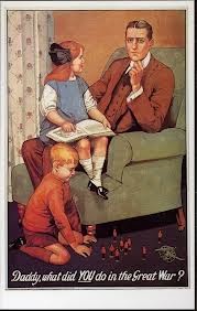
Likewise, Savile Lumley's poster shows a traditional, English, middle-class family stereotype - though less exaggerated. The young boy is playing with model beefeaters (Yeoman Warders), which are typically English. The text used in this poster is in script, addressing the father from a child's point of view making the question more personal to the target audience, (men in the early 20th century - during the war, particularly fathers or men of that age). The underlined 'YOU' also makes the question more direct, and links to the illustration of the father - making the audience feel as if they are in his shoes.
The type in the first poster is integrated into the image and the Westernised, gold, slab serif font portrays connotations of wealth and power. The war poster's rhetorical question is more a more gentle, clever approach to catch the viewer's attention compared to 'The Uncle Sam Range' which comes across as more demanding through the capitalisation and boldness of the font choice.
The clock on the wall shows it's the 100th anniversary of Independence Day and that the rich and wealthy America has been feeding the world since then (hence illustration of 'the world' sitting at the dinner table with them). The list that the world is holding shows the food that other countries produce and/or eat, which suggests that America is so far advanced and powerful compared to other countries that it can cater for everyone. This reinforces the advertisement for the cooker - it's an American cooker so it will be more advanced than any other cooker one can buy.
Neither of these posters actually talk about or note directly what they are trying to sell, both are quite subtle and show possible futuristic images of what the audience's life could be like - one positive and one negative. The persuasive technique of the advertiser showing positive connotations of a wealthy, American life leads you to believe that if you buy 'The Uncle Sam Range' cooker, then you also will live like the man on the poster. I think it's primarily targeted at middle-class citizens. On the other hand, the futuristic situation that the second poster demonstrates is negative, showing the father gazing away from his child in thought - possibly regret and guilt having not gone to war, therefore being unable to tell his children stories and perhaps feeling like a coward. This is also a good advertising technique, playing on the viewer's conscience, making them not want that to happen in the future, so they would want to sign up to go to war.
No comments:
Post a Comment